@rmehta Why was this decision made? This seems to be the opposite of popular opinion. Considering the most popular discussion on the frappe.io discussion board is for upgrading, not removing, the desk, this action makes no sense.
Even if you were to remove the current desktop, why not keep the colors/icons on your idea for the new ‘deskless’ setup? At least then there would be some continuity carryover.
I’ve created a poll to see the communities’ opinion:
While I do agree that the desktop needs a change (like a widget/dashboard system), it’s one of the reasons on boarding new users was easier.
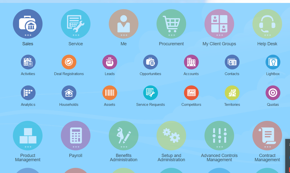
Being overwhelmed with links in the module detail view is one of the main issues we face. As new features/doctypes are added to erpnext as well as custom apps/doctypes are made by companies, this page is bound to become unmanageable in its current form.
At this point, most of my organization uses the desktop and search primarily.
I prefer colors in new Homepage and new module page to distinguish each item. Ex, Light grey background, white background each item with blue header text and Icon.
This is great news. I wholehearted welcome it.
Nonetheless, why don’t we get to have both and allow the user to choose the preferred one?
In that case, it is a win-win for everyone.
I’m generally a fan of change, but in this case I think that the old version should be kept, for numerous reasons almost all of which were said already, other than the fact that the switch will now require training to be done all over again for all users, other than seasoned ones.
but if you really want to change, at the very least the change should be optional. and instead of changing the whole thing, maybe there should be some upgrades like a menu bar, icon groups, add your own icons (sans scripting), maybe we can learn from QuickBooks to design the setup of icons around a workflow.
All in all, I think we can work around the clutter issue, but still keep the desk.
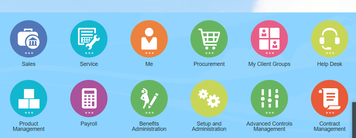
You cannot kill an icon, it is just like you cannot kill a god. My understanding here is to add a 3rd view which is dashboard view. If what I think is wrong, then we are heading into disaster.
Exactly, populate 2 or 3 icons every users and they are good to go. On desk view, users just click icon 1 for this work or click icon 2 for another work.
This is certainly much clearer for new users, will feel less overwhelming and much more to-the-point
Once a framework is set, if a user wants another nav option, he can build it on top of existing stuff.
Why not maintain both? A user can freely switch to the other anytime. If using mobile phone, better for me to have an icon on desktop. If on deskptop, I can take a shot on the new desktop design.
Well, if you are going to change the desktop to something that has textual frames to click on instead of the medium sized icons then my first reaction is:
“I am going to loose all of my older users!”
I already fight with them in v10 because most of the text is in light grey against a white background. They complain they have a very difficult time reading it or even finding something on the screen because it gets washed out in the white background. Please… PLEASE… do something to make the contrast of important elements on the screen easier to see.
My second reaction was:
“How could this possibly work and still fit on a mobile phone screen?”
This is where the icon desktop shined brightly. It was super easy to find stuff on the smartphone and touch the icon to get busy. In v10 you can even create your own desk icons for specific things like individual reports that you use the most. This reduced the complaints about trying to read a small screen (with light grey on white, etc.). With everyone doing even more on small screens, don’t you think simplifying that view is better than making it even more complex to see?
And my final reactions was:
As a desktop application on a 22" monitor, the new layout (if properly contrasted visually) would be very helpful to the moderately experienced users. New users may still wish for the old icons for simplicity sake, but even they will appreciate the new layout once they get more experienced as a user.
That was the collective response of my current clients using ERPNext. They represent a little over 300 individual usernames spread across my 6 largest ERPNext instances.
I am following this discussion without much of an opinion on my own really. I am using the awesome bar (that’s the correct, official name, right?) to find anything and personally do not care about the DESK or anything else I am not looking at for myself.
I am aware this is not the way for anybody and many people are more visual and like to navigate through any application via mouse clicks/taps.
I feel about this discussion that many people have strong personal opinions towards one or the other solution but I was wondering whether it would make sense to assigning a UI/UX designer to this task?
I understand that this may be costly (thus far apparently no one from the community came forward I believe) but could imagine such an investment paid off on the long run.
that let us not think about the user as one of us. We can find our way through any type of interface. Remember memorizing and typing transaction names in Oracle and SAP. Not everyone needs to access the data hierarchy every time and they may not even have an idea about it.
That interface works in a perfect way for the mobile user especially while using a mobile phone as the access device.
I am against any unnecessary effort just for the sake of updating. Efforts towards new functionality like posting and keeping track of Bank Loans would add more to the customers.
@wale looks much better with text and icons in the upgraded version! for right and left brain.
on mobile versions a reduced simpler version with only the icon and short text could work for tab with fingers.