Hello Community,
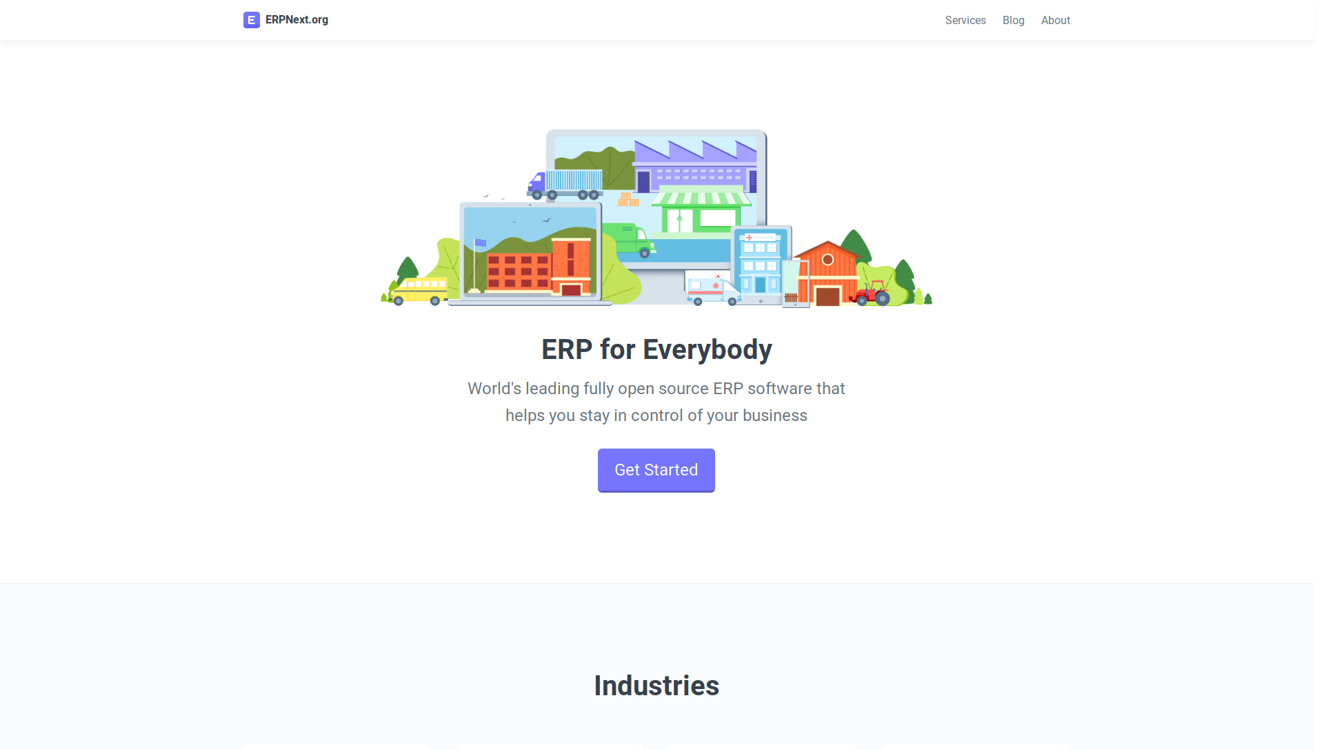
As per our ongoing effort to give the ERPNext foundation a new identity, we have redesigned the website. https://erpnext.org/
This is the intitial release and we will be further refiniing the design and optimising the website for SEO purposes.
There will more sections coming on the homepage based on the discussion in today’s foundation call.
Feedbacks and improvements are welcome. If you find any critical issues please raise it on Github
18 Likes
How does one search the documentation?
Just the way one did before. Currently, the link to the docs is available in the footer. In docs search is still planned.
A lot more has to be still added in the navbar. Any suggestions are welcome.
@magic-overflow
Thank you for your detailed feedback, I will try to address those issues in the next updates. Our next goal is to polish and iron out all the inconsistencies. We will also work on the copy matter. Any help regarding the content is welcome.
Any suggestions to improve it further is welcome.
1 Like
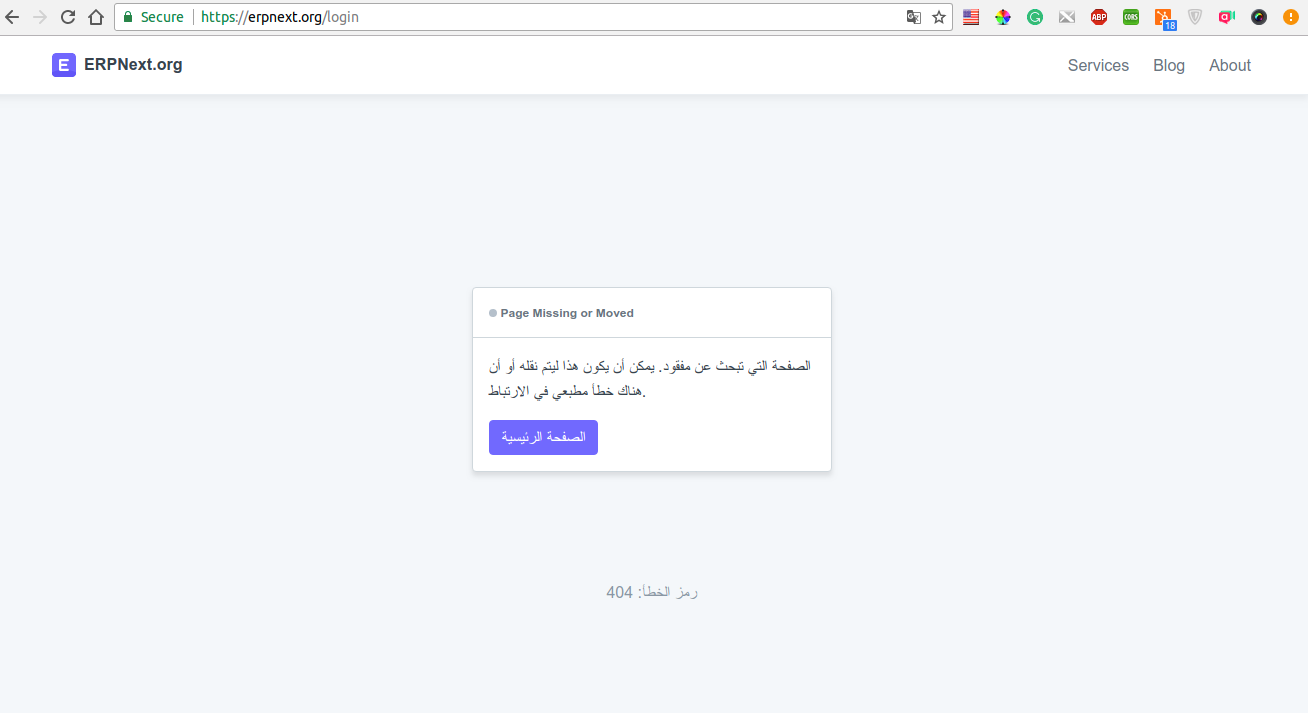
Hi @OmarJaber,
Thanks for finding this issue, it is fixed now, thanks to @netchampfaris for fixing it at lightning speed 
1 Like
Like being able to search the documentation? This seems like a critical feature to me.
Suggestion: Play video at the back instead, actual businesses
Yes as @kennethsequeira already mentioned we are planning to add search to docs.
Here are few points I noticed:
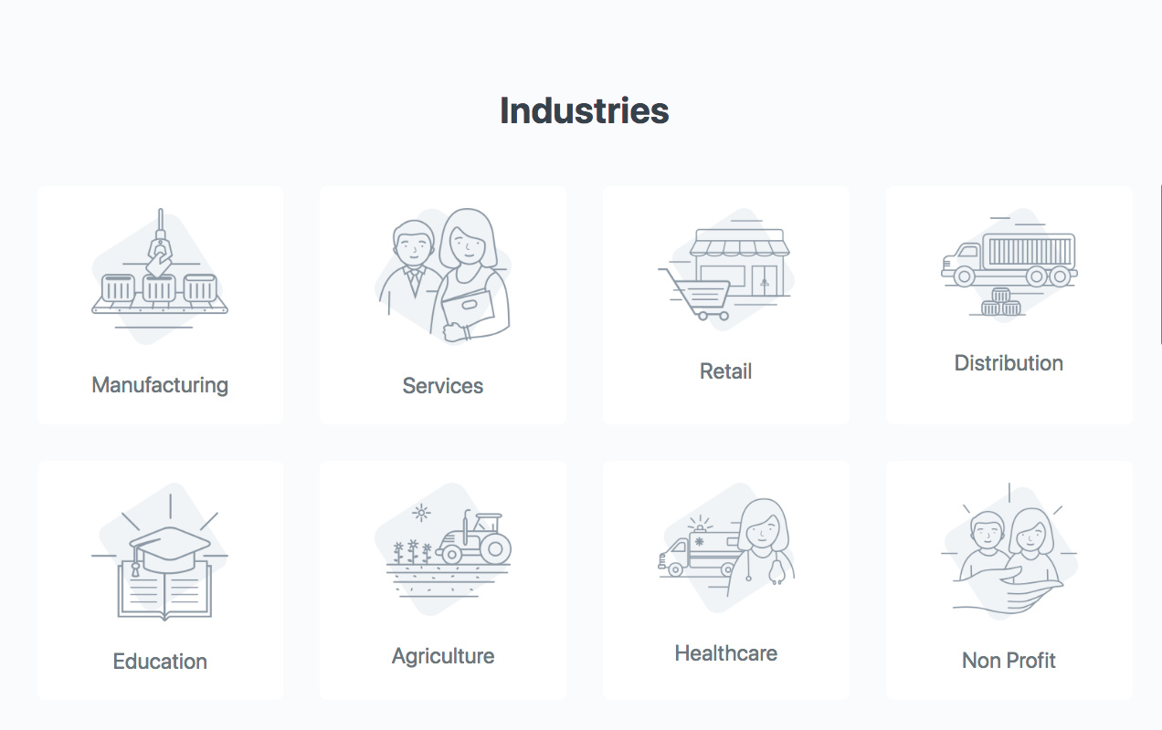
- Services in Nav bar is confusing since it links to Service Providers (and not ERPNext Services)
- Maybe a navigation bar that’s linked to the sections of the page could be provided? As a user, I’d like to look at certain sections and getting there by clicking a link instead of scrolling down to view the whole page
- Clicking on an Industry leads a visitor away from the page (and towards the documentation). Maybe either a popover/modal/div with a short summary of the industry/domain would do?
- From a lead conversion standpoint, the only call-to-action button is the one on top (Get Started).
- There’s a bit of inconsistency with the terms Domain and Industry (Body mentions “Industries”. Footer contains a section for “Domains”. Contents are similar.)
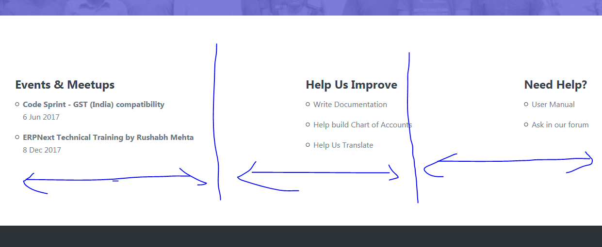
- “Events” looks somewhat misplaced when placed with “Help Us Improve” and “Need Help”
- Maybe Help us Improve and Need Help deserve their own section? If you do decide to add sections for the two, you can move some of the items out of the footer an into the Help Us Improve / Need Help sections and make the footer less cramped.
- The “Contact” form is for both foundation and ERPNext concerns, right? So it should probably be somewhere under ERPNext and not under Foundation alone.
- I agree with the suggestion that you should include user reviews/testimonials.
- Lastly, there’s a floating “None” text in https://erpnext.org/about , just right below the description text.

Sorry for the long post and I hope it helps.
6 Likes
What I really like about this forum is for it’s constructive feedback and that they care about the work as much as its their own. It’s the only way how software can progress - incremental feedbacks. 
5 Likes
We are planning to have industry or domain pages linked to these. The pages will have listing of features relevant to the industry with links to documentation of the features.
That is fixed now, thanks for pointing that
Thanks for the feedback 
1 Like
Lovely website on my mobile phone.
What I noticed was on the a full screen monitor, it looks incomplete (too much white space as someone noted).
- You could make it a 2 column table alternating image and text (a small blurb) each time.
- You have a wonderful web designer / agency. Pls. use something other than Grey. It is lively to have some colors (similar to the main image, which I think is absolutely trendy, modern and appealing to younger audience).
@Not_a_countant what device + browser are you using? On my laptop the Industries section is showing correctly.
Here you go. It is probably slightly outdated.
It surely is outdated  but I don’t think that should affect the alignments so much.
Looks better on firefox.
Could we add an email collector / sign up on every page as a floating box? or a gentle pop up when they either enter a page or leave a page? And once they have submitted, stop reminding.
Now on firefox.
Could use a better alignment. Not sure if it is intentional or just did not get set right.
I think one section on the front page and some other pages should have an email collection form instead of a floating button. And have a link in the footer as well under “Subscribe to our newsletter/mailing list” or any other appropriate heading. Thoughts?