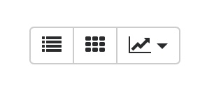
I know that using icons is dangerous territory, but in many places it serve better purpose and less scary for the user than text. For example:
 ==>
==>
5 Likes
I would be totally lost with those icons. I much rather prefer text but that is a personal preference. I’m not an expert on UI/UX but I can see the suggested navigation being more familiar to a lot of business users. Either way, I believe it should be an optional setting.
1 Like
@joshreeder @netchampfaris @rmehta See the following suggested sidebar. In it you can have both, the main menu and the secondary menu and you can toggle between them easily. Also, instead of having drop down menus within the sidebar, it becomes embedded with in the menus. moreover, a toggle that can be used to fix the sidebar in place.

11 Likes
I think this is an interesting approach. At first glance I’m excited to see the motion.
Although I think that our main navigation is critical to the experience for fast movement and a visual awareness for where you are in the system and how the menus become the breadcrumb system. That would get lost here.
Not sure it needs to ever be hidden unless on mobile or tablet.
And it also seems like the directional hierarchy is a little lost since this isn’t pure left to right movement. Although I love the motion!!! I think speed and usability would render the animations an obstacle after the newness wears off.
Man thanks so much for participating with this great rebound. Let’s keep discussion going. You’ve got me thinking for sure…
I would like to add one comment. Remember that ERPNEXT is available in multiple languages, some that read from right to left so be ready to adapt to those languages. Also, if you make a menu by alphabetical order in English, you can be pretty sure it will be scrambled in another language, unless of course if you find a way to sort the menu entries on the fly.
This is also what i was thinking when i saw the screenshots. Too many extra icons and breadcrumbs on one page could hurt the unique simple style of erpnext.
we mainly use and enjoy erpnext because it does not use the overload that most other feature rich software or ERP facing these days and i think this simplicity, usability and design is the key that helps erpnext to be so new and attractive to people that are not into complex software and takes off the fear to dive into work with it. although also when it cost one click more. i think for these people its the quality of simplicity to learn and use the system (maybe we can never measure this), not the quantity of speed to browse so fast as you can. and for all pros, the searchbar is already an ultra fast alternative.
some thoughts of improvement:
-
i think the desk icons are nice, but should be more unique and meaningful.
(solution: maybe an order for an flat erpnext iconfont (released under creative commons for caring) could give the project and the desk a more unique identity and also solves the double use of icons which leads to much better usability.) this could be done by an experienced icon-fontdesigner or if possible making a set of existing icons that fit to the project needs. downside: on new app we have to still use a standard font that do not fit perfect. it takes time to make a new icon also with flat icon style. maybe there is a way of mixing icon fonts into a set that i do not know. -
what is also confusing us is when we browse the navigation in desk#modules/Setup and we go for example through the print settings. every sub navigation point under Printing > sounds the same for a beginner! 5x print format builder… printformat… printstyle… so from time to time we click the wrong one because they sound so similar.
solution: i don’t know for now. maybe a simple hover (hover is cool because on a page with hundreds of links there is always just one icon visible and only exact when you need it) with tiny geometric forms (triangle,square, octahedron…) or iconfont or numbers next to the text helps to not click on the wrong text by accident when coming back again for the same menu print link. background: from brain research we should know, brain remembers best with text (one half of brain) and illustration (other half). this is why desk would work perfect with unique icons, because they have graphic and text under it. downside for the hover symbols: slows maybe down the page loading. maybe caching could help.
2 Likes
Great thought provoking discussion, thanks to @joshreeder for initiating it. While I am not an expert on UI designs, I have seen people struggling to get to the page that they wanted to. While it was very easy for me to use the global search bar, it is almost unusable to less tech savvy people, no matter how much you teach them! So there is certainly merit in thinking about UI improvements. However major UI changes could be problematic.
In my case, I solved our navigation problem to a great extent by adding ‘desk icons’ for frequently used ones(in a custom app). We generally use 10-15 doctypes frequently, so it wasn’t a problem adding most of them to the desk directly. If you could reach the page you need in 2-3 clicks, perhaps one should consider it as a good design. So I am really wondering whether this is something which couldn’t be solved in the current UI design? I see two parallel approaches to the one suggested above.
- Keep the current desk and add a ‘Frequently used’ section for each module at the top that list top 5-10 pages that are frequently used by that user.
- Keep the current design and make module pages configurable similar to desk icons.
It is difficult to solve every ones problem by a different design as we won’t know what is useful to them. However allowing them to customize it as per their needs would give them that provision to some extent.
8 Likes
@joshreeder if you are going to implement this, please do it in small parts and get the non-controversial changes merged first. A full PR with all the changes you propose will be impossible to merge.
1 Like
@joshreeder
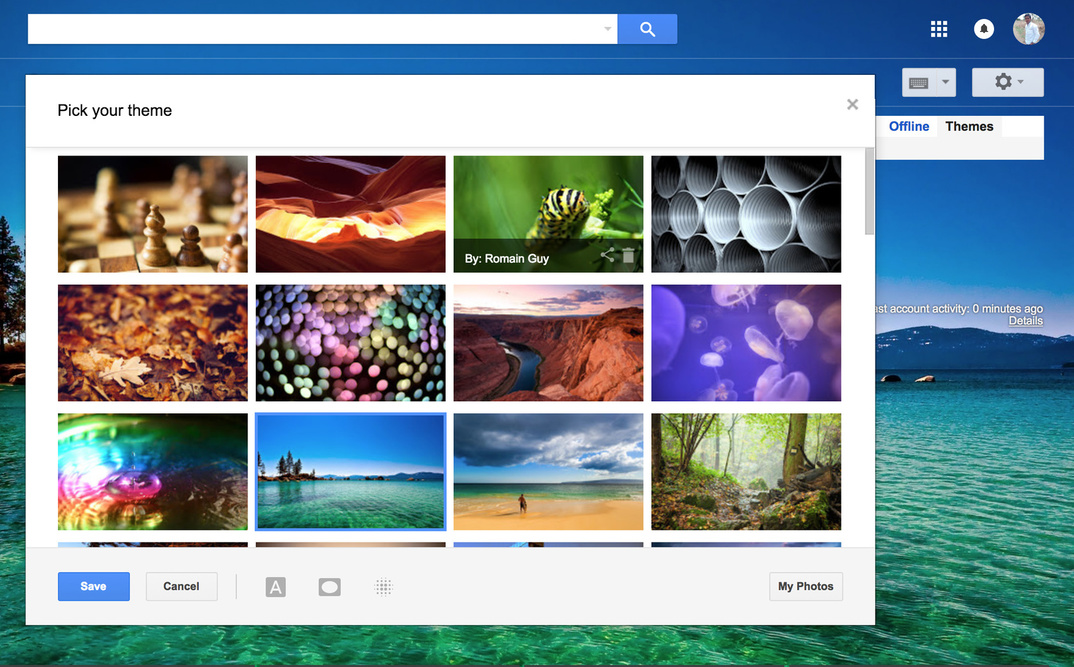
Why not enhancing Theme module in ERPNext?
We already have website theme, similarly we can have Desk Theme.
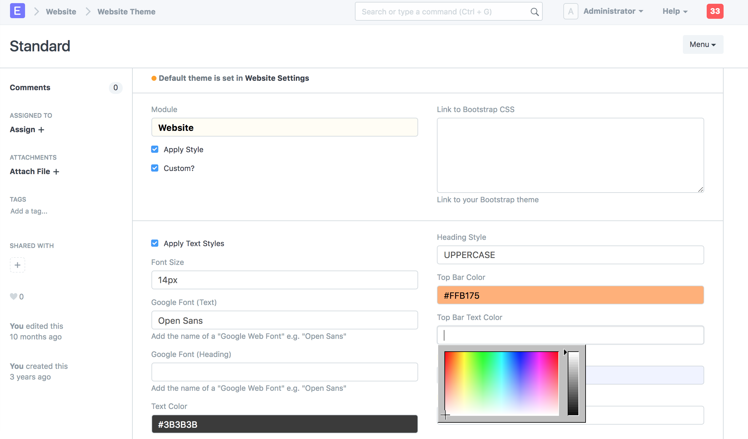
Anyone can use Desk Theme without installing custom app (As it will need only css and js)
We can add option to enable/disable sidebar
E.g.
Gmail Theme:
3 Likes
Theming is something you do at the CSS layer.
The proposed changes are way more than CSS changes.
Just to add my 2 cents.
There should be a consideration for the support for Right-to-left (RTL). The current version has finally supported it. We do not want to start over ![]() .
.
2 Likes
To be honest, I think desk navigation is inadequate. I practically use only global search because I can’t seem to find anything if I were to depend solely on the desk icons.
One thing that makes me want to cling to the proposed design is that the navigation can follow you everywhere like global search so you get the same agility of global search.
However, it seems you can never be wrong with the global search bar. This might sound stupid but we can just glorify the search bar…
8 Likes
The more we glorify global search the more we make the case for a revamp of the current desk navigation process.
Global search should not be the default in an ERP solution. It’s what you use when the current navigation or your memory fails you.
Olamide
6 Likes
I totally agree with you guys. Global search is good and powerful , but is not a replacement for clear easy to use navigation interface. Global search is an extra layer of navigation not the main navigation. For example, you can’t ask a new user how knows little about the internal doctypes and modules to rely on global search.
Saying I only rely on global search, you are basically wearing your geek hat and not thinking about the UI usability for the normal user, and thats the main problem when the engineers also design the user interface ![]()
Also I agree with who said here that
Desk is just a glorified list of bookmarks
For me after I login the first thing is click on any desktop tile just so I can start navigation from the said bar. So really does the desk serve any purpose? its not like they are live tiles and provide you with information about their linked modules and doctypes
8 Likes
Ok, I’ll start thinking through a phased plan but I think it will have to be done essentially together and rather quickly nonetheless.
Over the weekend I exported the doctypes list and dug into each item but there are other pages we use that need added to the list like certain pages and such. Trying to plan out the full reorg list and where everything belongs. The experiential elements fit for a “department” if you will do not map cleanly to how modules have been developed out over time. Like “Sales” and “Accounting” are not clearly separated like they are in other software solutions. So just mapping modules and doctypes as they are organized in the code will not be the best solution for the users. And I know we have addressed this as the modules menu also does not map cleanly.
That said, It is thrilling to see the elements and pieces start to fall into place as I remap this with fresh eyes,. A few months from now I think we are going to be very happy. once i have a detailed Excel sheet and screen shots of the reorg I will pass along.
2 Likes
If there is a consensus to re-think the UI, then there must be more thought placed on the mobile devices that are increasingly at the heart of ERPNext users.
So… while the new sidebar looks wonderful on a computer screen, it would not likely scale well to a smartphone or tablet. We already have some growing issues with the usefulness of ERPNext on mobile devices. There are some screens that cannot work below 1080p resolutions already.
While I am hopeful that the foundation takes an interest in their product being mobile user friendly, I am currently stuck using high resolution Chromebooks and MS Windows Surface Pro devices to get some mobility out of the system. Modules like POS and Stock Transfers already do not translate well to mobile screens and a UI change like this further threatens the mobile market. That is really just not going to be sustainable in the near future when all of the competing products are already focused on elegant tablet and smartphone user interfaces.
That is just my opinion, ( and you know what they say about opinions ![]() ) but if ERPNext is going to play in the mobile market, then it is increasingly getting late to start focusing on that visual element of the system.
) but if ERPNext is going to play in the mobile market, then it is increasingly getting late to start focusing on that visual element of the system.
BKM
2 Likes
My less tech savvy users mainly use Sales Order, Sales Invoice, Purchase Order, Purchase Receipt, Purchase Invoice, Journal Entry, Payment entry most of the time. As soon as they login, they see all of them in that order in the first row of the desk. The second row has some of the reports they use very often. The third row has the module icons, which they can click and try to navigate to the page they are hoping to find. While I agree desk is a glorified bookmark, it certainly is very useful when configured properly as per your users need.
This is what needs to be fixed in my opinion. The side bar isn’t configurable, so it contains a lot of modules we don’t use and there doesn’t seem to be a way to re-configure their order. The ‘bookmark’ organization inside the module page isn’t also very intuitive. Having said that, after using it over some time, you will eventually get used to the layout.
While everyone thinks there is a real issue with the ERPNext navigation system, I don’t see consensus on how to fix it effectively. So I would really suggest brain-storming this further and resolving low hanging fruits first before trying to come up with major developments. We should also remember that any UI change will result in re-educating a lot of less tech-savvy people.
FWIW, I really like this conversation. I am not a user experience expert at all, but I can tell you that I am a technical person and I get lost sometimes in ERPNext. I am constantly working to help my users understand how to navigate around the tool to find what they need. Global search is not the panacea here. Good software should not require a complex procedure manual! Users should be able to intuitively find what they need. If this new desktop/navigation approach does that one thing it will be worth all the effort.
One thing that really bugs me in ERPNext around this topic is list pagination. The more button is horrible. We need true list pagination. I also want to be able to quickly move from record to record in a list. Once I set a filter on a list and open the first record, I should have a next record/previous record option on the page so I can just move from one to one if I want. In the list we need real pagination like what github has or other well designed applications. Keep the “number of records to show” on the left, but turn the right into pagination.
I also want to make it easier to hide things from users. For example everyone has “access” to read the company and fiscal year records, but they don’t need to see them in navigation! It just creates noise to the user. Based on roles or groups, as an admin I should be able to set what people see to minimize noise. Just cause you have read access to a doctype, does not mean it needs to show in navigation to the average user.
Thanks for this topic.
12 Likes
Good point! Also bearing in mind that the Global Search bar is actually more useful to folks who already have an idea what they are looking for!
Cheers!
2 Likes
I absolutely agree with this but I also don’t think that the current approach of relying solely on mobile responsiveness is the way to go! This is an ERP with several different kinds of pages, layouts, reports, documents etc. We need to start looking into building native mobile applications with native elements that mobile users all over the world have become used to
This is why I’m particularly thankful for the foundational work being done by @revant_one and other members of his team in this area. I hope to see it grow to a point where it replaces the current ERPNext mobile app and becomes a community effort
This is one of the areas that really requires attention in the UI. The Desktop shouldn’t just be a collection of icons which easily becomes redundant as evidenced by all the feedback here and in other threads. It should be ‘Information Central’ where we can get critical metrics from different modules in the system. This is the kind of thing management likes to see and ERPNext needs a lot of improvement in the way it collates and presents information to management
Cheers!
1 Like