Hi Guys, I was working on dashboard charts and had a few doubts. It would be really helpful if someone could please guide me.
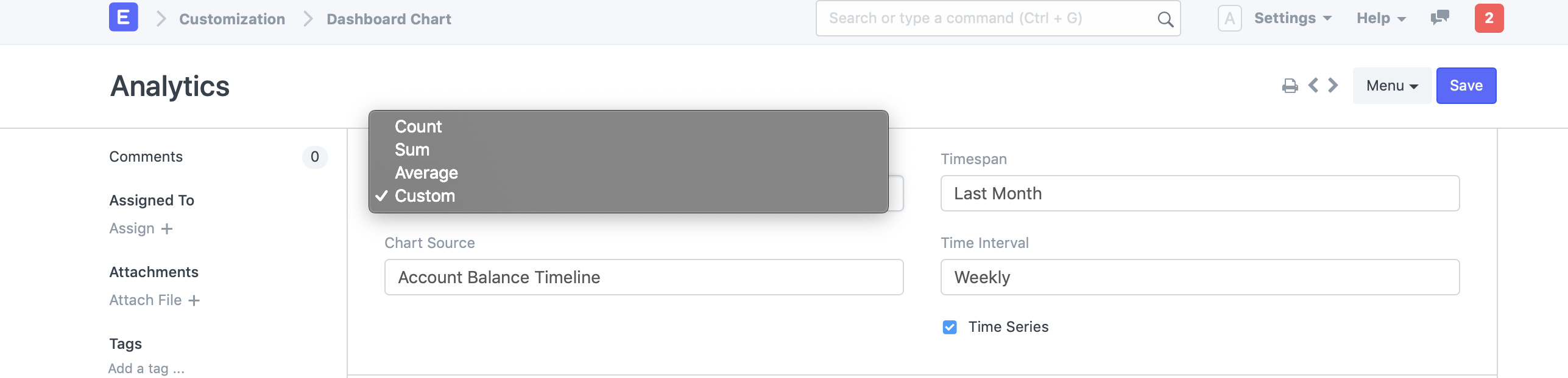
When we create a new dashboard chart, we get four options: SUM, AVERAGE, COUNT and CUSTOM. How are they different and how can I use them. Is there any tutorial on it.
Also when we create charts from Sales Analytics, Purchase Analytics or Stock Analytics. Is it possible to make the same kinds of charts for my dashboard using the dashboard charts feature? Or maybe we could add those charts to the dashboard itself.