Great work and initiative!
I just hope that the module access menu on the left is accessible so that I wont have to scroll down to click on a module
Great work and initiative!
I just hope that the module access menu on the left is accessible so that I wont have to scroll down to click on a module
I am working on this too. I’ll finish it up and share. For the first pass, see the menu builder. The module icon has the option to set the path for initial path for selecting a module and I will add a default module choice for the site home page but want to add dashboard builder that can be used for these and som defaults.
Not sure I follow. You mean the traditional modules view? My goal is that that is reorganized into a admin settings set of items and normal app use for everyday records is part of the new organization. This makes both things far less huge. Now that admin settings and setup (traditional modules view) is accessible if you have privledges in the top user nav dropdown in your user name. So for admins it’s even easier to access.
Also if you are an admin, and you are using the settings view from the top, and say the menu selection is developer/doctypes and you edit one and then accesss it from the sidebar to test and then go back to the doctype menu. The paths are still set since they are different menus now and they will default to were you last were thanks to how they are appended and hidden as you go through the system. A huge benefit and mentally satisfying to be able to build and then use. One from the top menu and one from the side. Separating these roles will help the developer see through the eyes of the user they are trying to serve well.
I have tried to do that oddly enough. Not sure there is a half way for reorganizing menus. When google updates there ui they allow users to upgrade or not and try to support the old for a while.
How does that feel? If we can get this done on a branch, and we like it we offer 2 builds for a while after making this one a major release but also offer the other for a long time it just won’t see all of the following upgrades.
Does that sound like the right direction?
Some thoughts
Great thoughts. I see your point but have considered this extensively and parsed through every single non child doctype. Around 300. I’d does scale if you consider what doctypes are used by the user everyday (about 50) and what doctypes are used inside those (contacts/addresses or product groups or bundles) and are not needed in menus or can be easily added as a button to the appropriate body section head ( in the items list add button for groups and bundles) or used for setup reasons and moved to the settings menu (customers / customer groups).
This means that list is way smaller.
In my opinion, we can do this and everyone will love it once they have lived with it for a week.
Some of us need to think as developers and others as user advocates.
Nothing is going away, this is a simple idea. Reorganize the doctypes by adding a new category selection:
Document (Master)
Sub document (supporting document)
Setup (top nav menu: Settings / Modules: Setup)
Settings (top nav menu: Settings / Modules: Setup
This is how all great systems work and are organized and we need to get there. We can do it iteratively or we can just get it done.
I think we use the momentum to get it done.
It’ll take a few days to show where all 300 doctypes and other pages views would live but charge out the view above with the settings called out and look at the organization. I think your gonna love it.
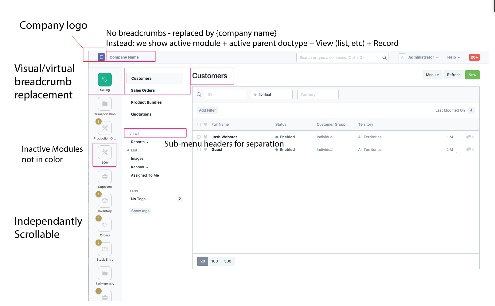
I posted 1. It shows the side bar with both the modules and menu visible. Don’t have it fully designed but the gist is tap a icon and then tap the submenu item to dismiss the menu.
Hi @joshreeder
Point 1 is what I was trying to say. Users would not want to scroll down to access a menu.
I completely agree and that’s why I am working on this. Right now there is no distinction from desktop what is going to dump you into the massive scrolling modules view with no memorable organization or a list view. Colors and icons and names are all on the same level.
Not sure which user you are referring to. Are you referring to the dev/admin or the everyday user of the system?
For the dev all settings are accessed from the top nav. No scrolling. It’s a page that is 1/3 of the current modules list and page length so no scrolling.
For the user, most will never scroll. They will be given 5-12 module icons they can rearrange the most common to the top. Icons can get smaller and no tile outline. Names can be just tooltips. No scrolling. And the sub menus have there documents at the top. No scrolling.
So I definitely agree and that is the point of this whole project.
Updated View showing no tile icons with a rollover state and the dom changes that fix layout to Bootstrap grid properly.
Names via right tooltip not working yet.
http://www.giphy.com/gifs/xT9IgCDe07de1YthsY
That looks really pixelated… look at this for full screen…
Cool designs. I’d like to share my thoughts:
Maybe we can start by implementing a small feature from these, and do progressive enhancements, rather than doing it in one big PR.
I’m personally not a fan of burying functionality like this. ERPNext is so powerful that discoverability is an issue - I often find new features by scrolling through links. And I don’t see how you can do this in a complex module like the Accounts Module, as an example.
However, I do get your point - feature the most used links and bury the rest. That’s just good UX in general. I’ll wait to see what you come up with.
Maybe a compromise would be to bury things, but have a flyout menu of some kind a user can click on to show everything in the module, as is currently possible. But that seems like a cheesy compromise…
Iconic, yes. Functional…not really…it adds a click to move between modules. Yes its just one click, but I hate that click so much 
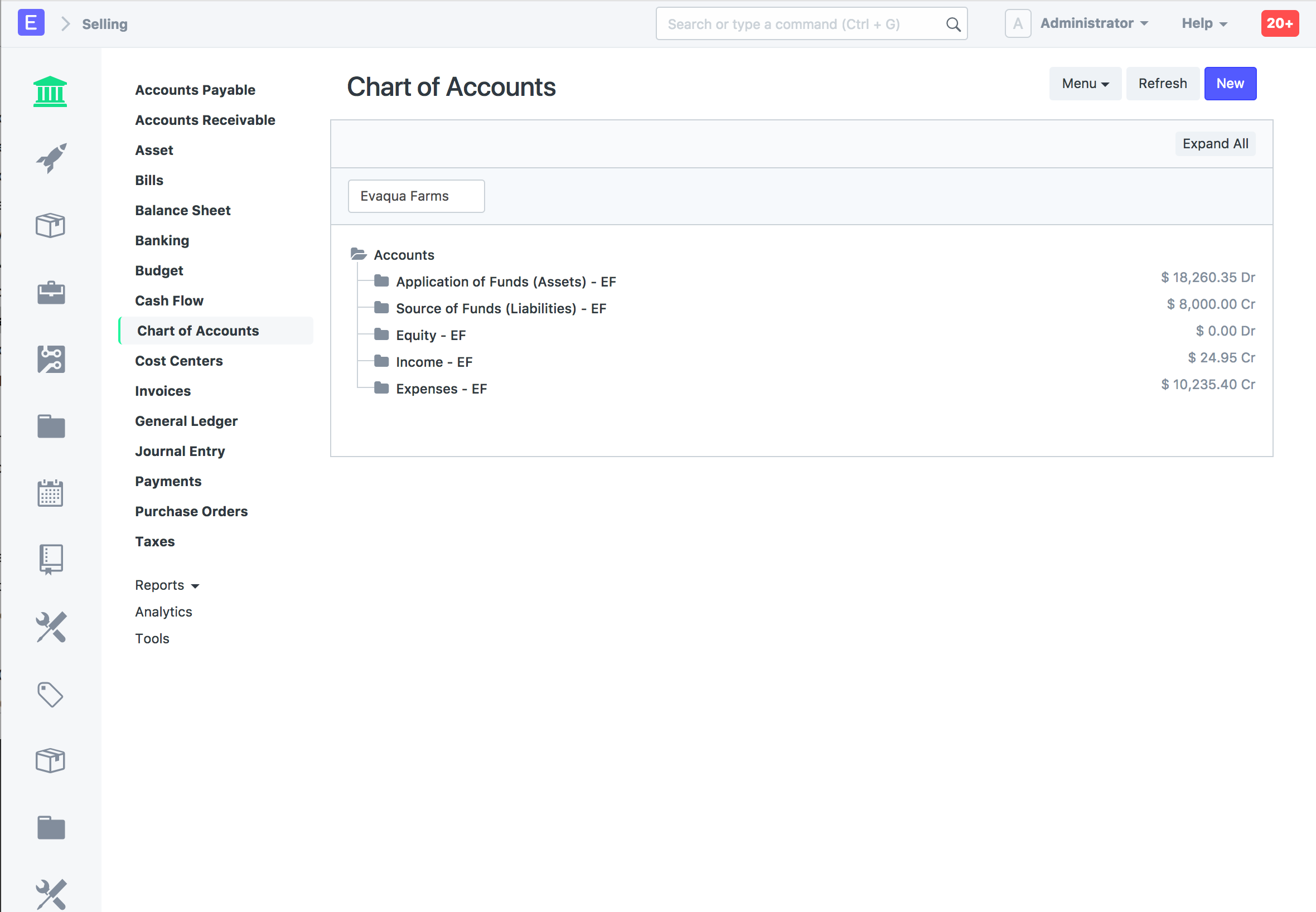
Good navigation can represent this. Breadcrumbs are implemented through the navigation here.
Balance is key to drawing the eye to where it needs to be. Currently we use Icons for module tiles. That is broken by the fact that several modules can use the same icon. Not good for training the user. We need to simplify that and continue to move towards what our users know, so we don’t have to teach them. They know:
Gear icon = settings
Pencil icon = edit
“X” icon = delete
etc… no training here, we do these things and we clean up the information the user has to take in to make decisions and it relieves friction.
Yes, and pretty much every decision we make to move software forward will do that. Sometimes major changes are needed and the only reason this would be a bad move is if it were int he wrong direction.
100% agree, but I think it can be done, it has to. The Frappe team and community have done an unbelievable job building an amazing body of code and done and amazing job keeping the front end looking great. But just like the code is constantly being refactored, the organization of data to the user needs this as well. This is a huge task, but we are 905 of the way there and it needs a little more work to be fully realized. Let me continue down the path here and show you how this will come together.
+1 for breadcrumbs in page head area
Let me recap where we are, if your just joining us…
This is day one of the discussion in 5 days, we will all be use to the idea.
Ill keep info coming as we get the final plan together so everyone can weigh in and be heard.
Keep the feedback coming!!!
The accounts module is bloated because it combines a few doc types and reports and links to other doctypes already represented like customers, suppliers, items, etc. remove the majority of duplicates and the accounting module can remain simple.
Guys on the Frappe team… If I go to set up a bounty for this, what should be the goal?
I have been watching this thread, but did not reply as this was not in my personal roadmap. Firstly its great to see more interest in this area!
In terms of general approach, before making a big design change like this, we need to ask what are the biggest problems in the current one and how are we solving it.
In terms of navigation, I personally use the search bar for almost everything. There are some things that could be better in search, and I would keep them as first priority. What we really need is good data + analytics of how people are actually using ERPNext (anyone with experience in this, please PM me)
The sidebar adds a new layer of complexity and to me it increases the cognitive load on the user. Now you have more options to choose from. More options are usually bad and users are more likely to get overwhelmed.
I like the idea of a unified “Settings” page though. You just go to one place to discover all settings.