I’ve spent the last couple months rethinking navigation and layout and hope to get support because what I am proposing is not an app but I am willing to fund it to get it done if everyone wants this.
Would love to know who would support this… and what devs would want to help or be involved.
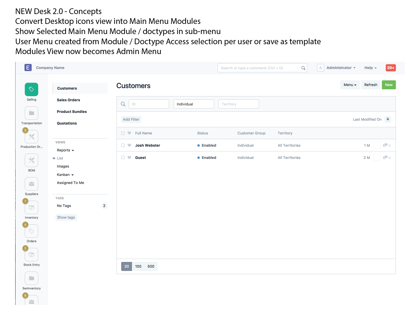
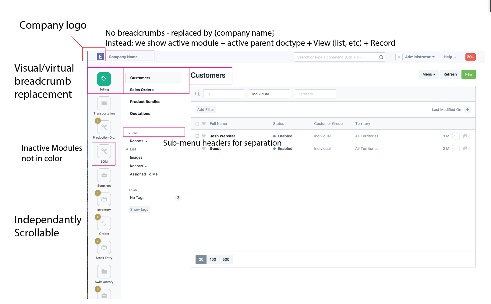
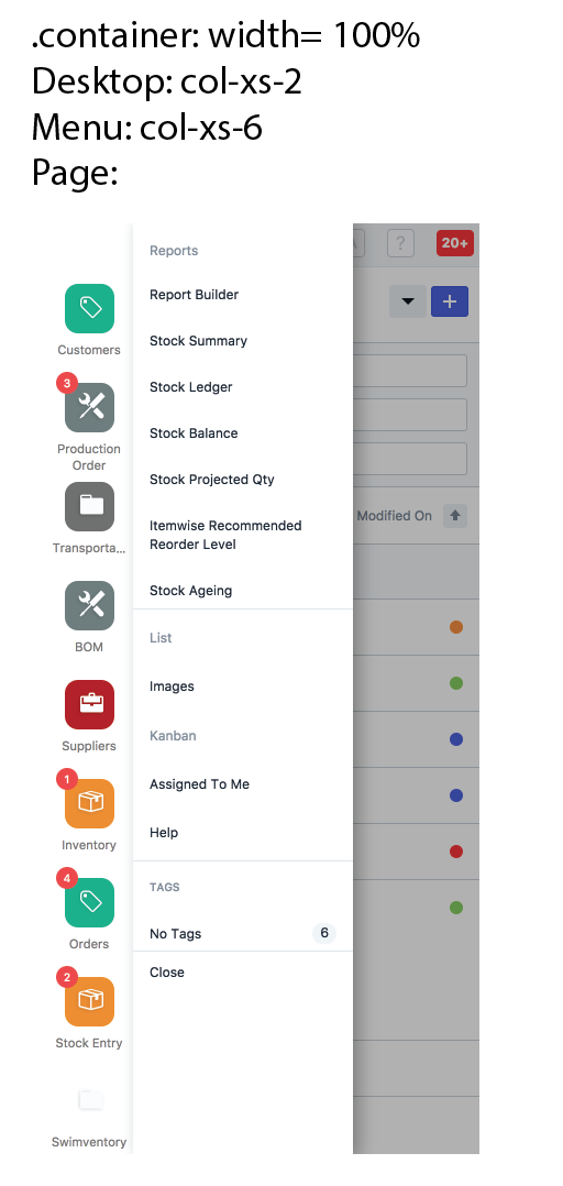
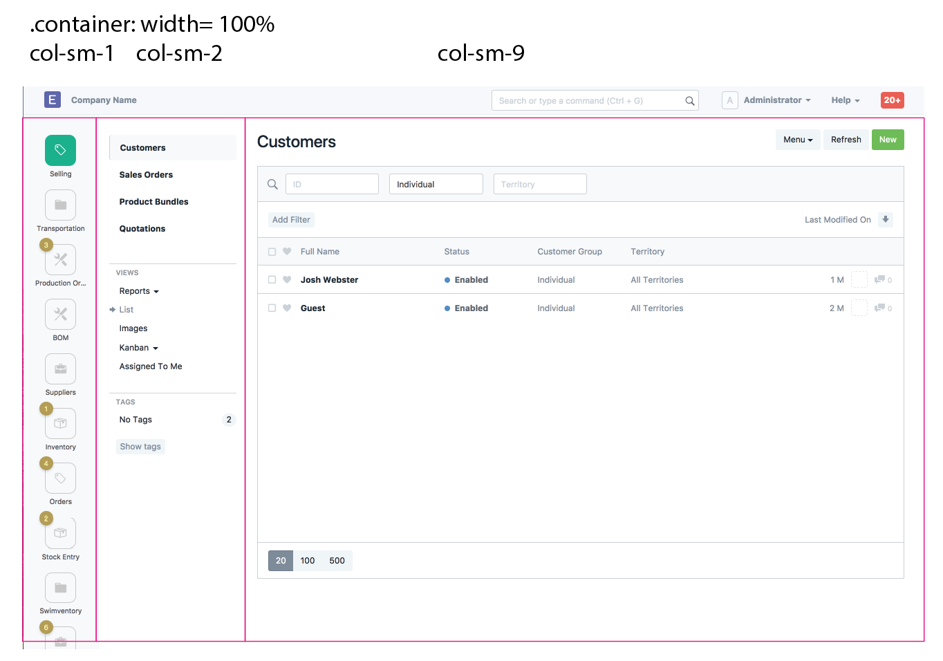
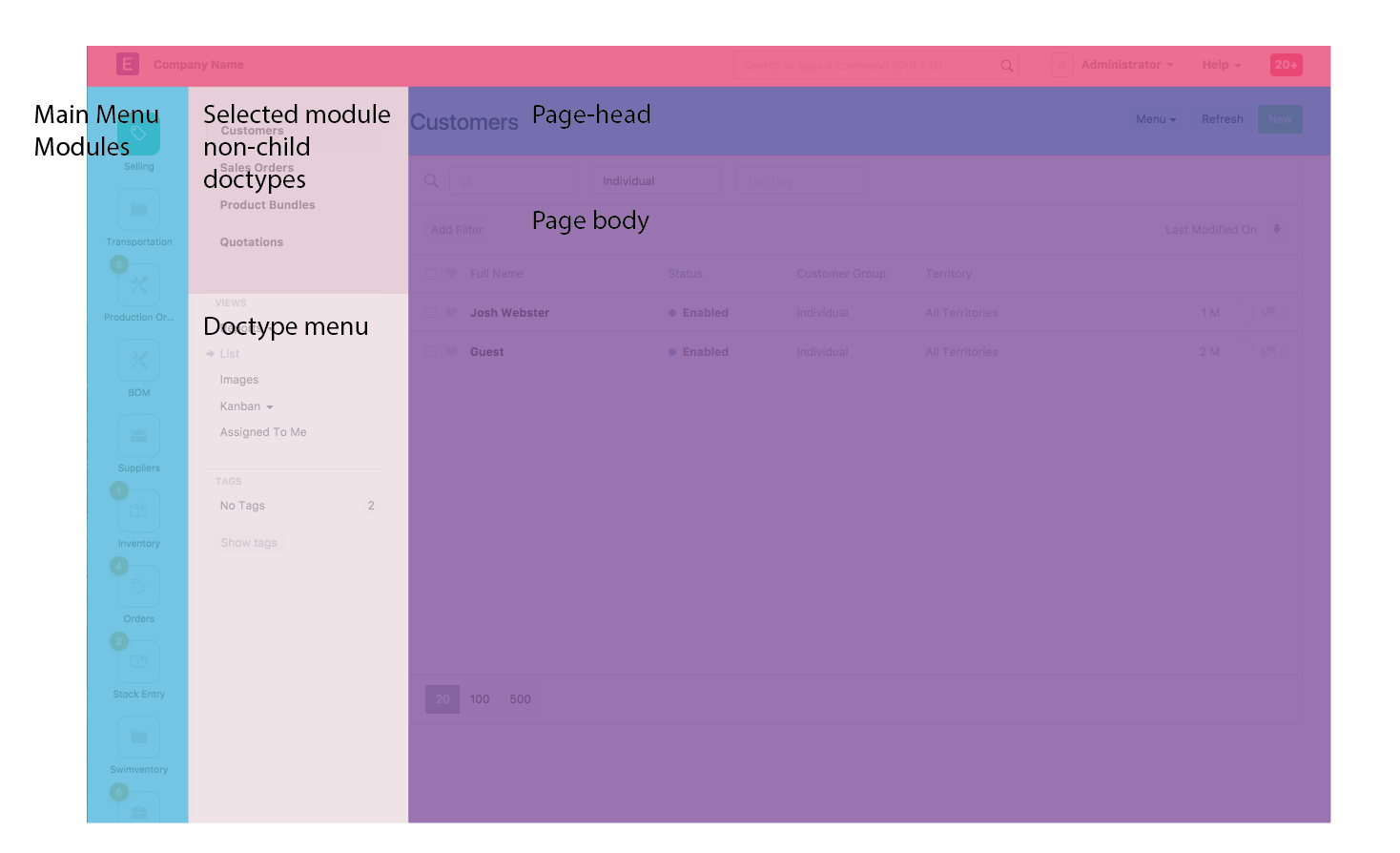
Simplify bootstrap layout
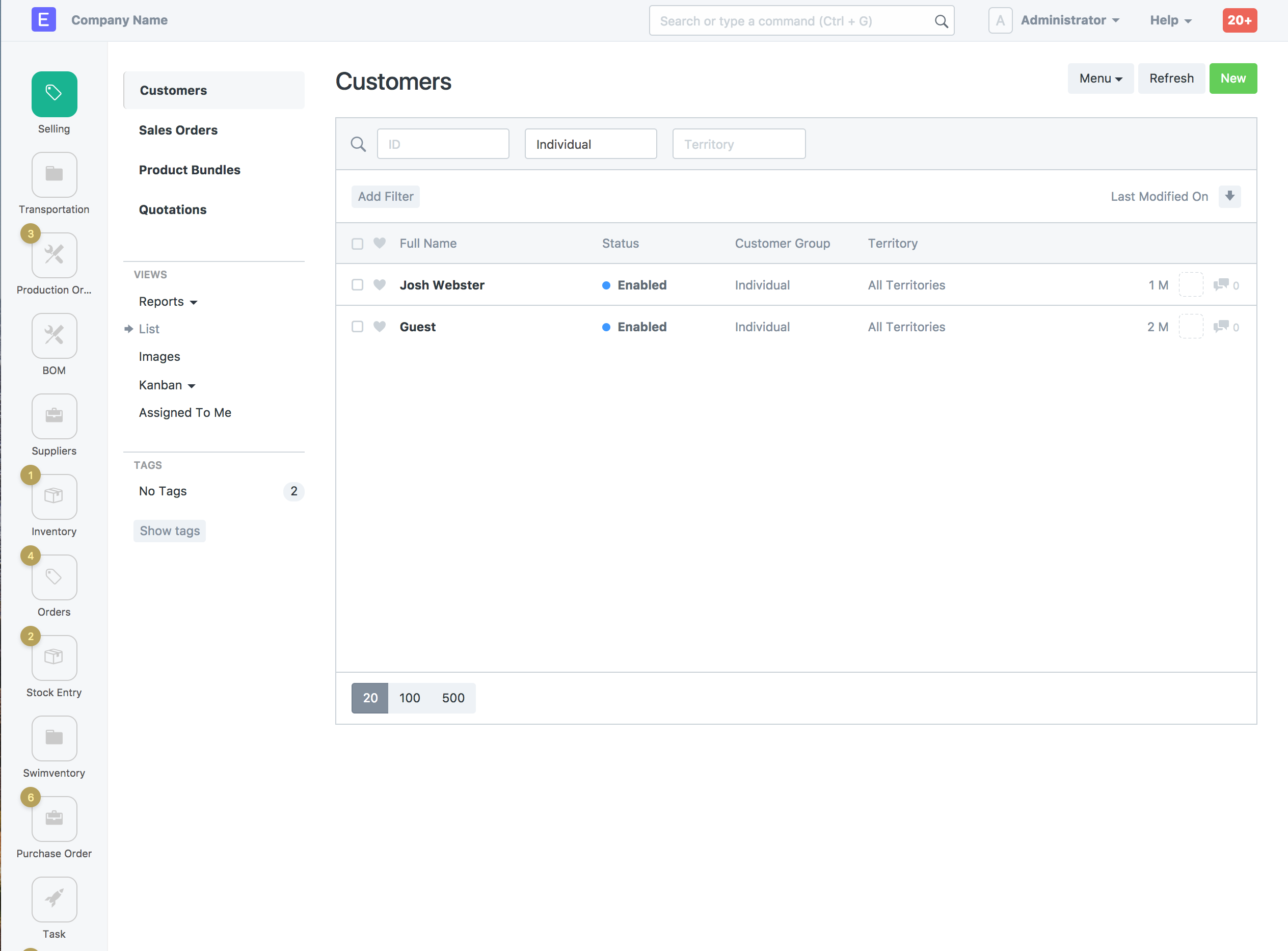
Convert desktop to part of the sidemenu
Simplify it to be modules
Add associated “Document” doctypes to submenu like module side menu
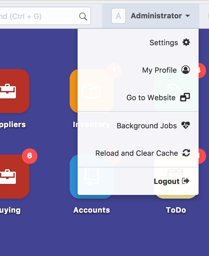
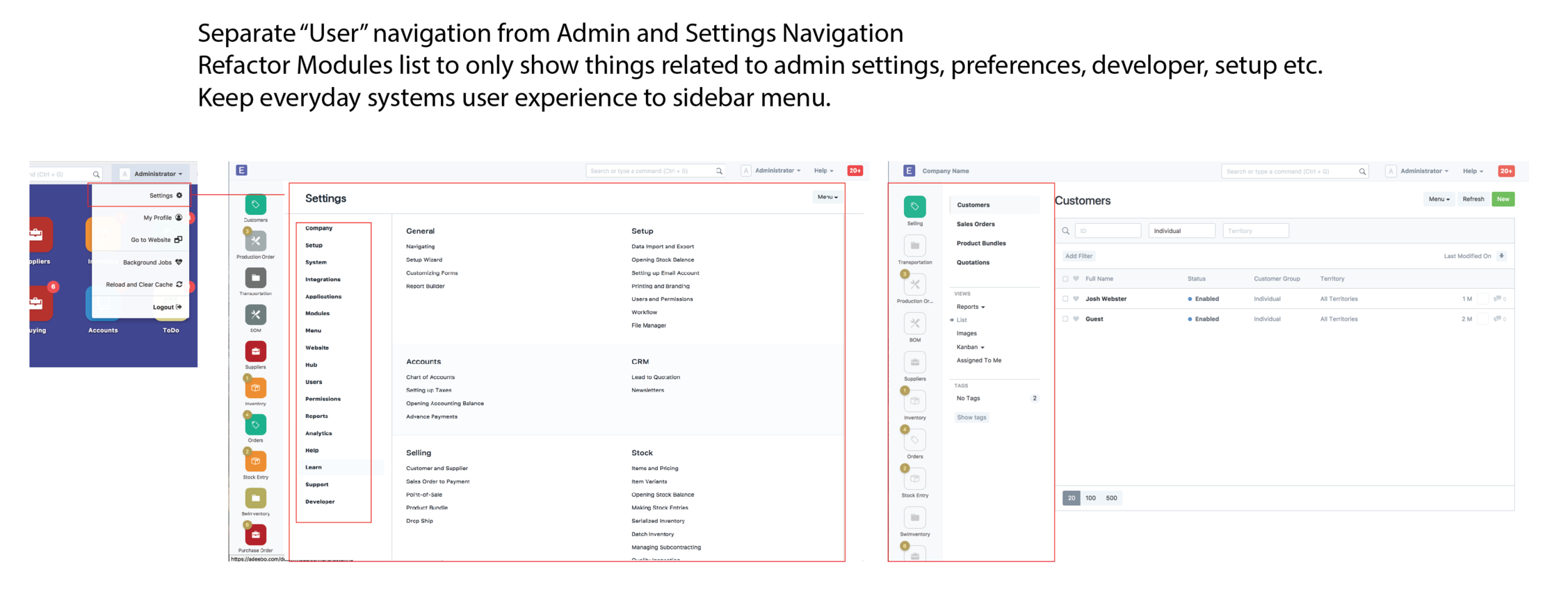
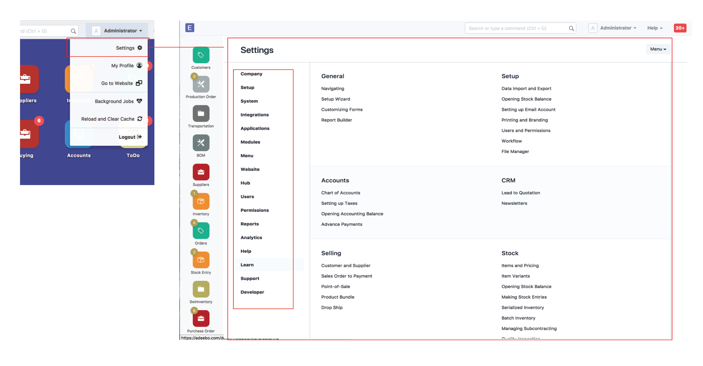
Separate out “user” navigation from “admin” navigation
Separate out help, videos, settings, and setup from module doctype lists and into appropriate areas
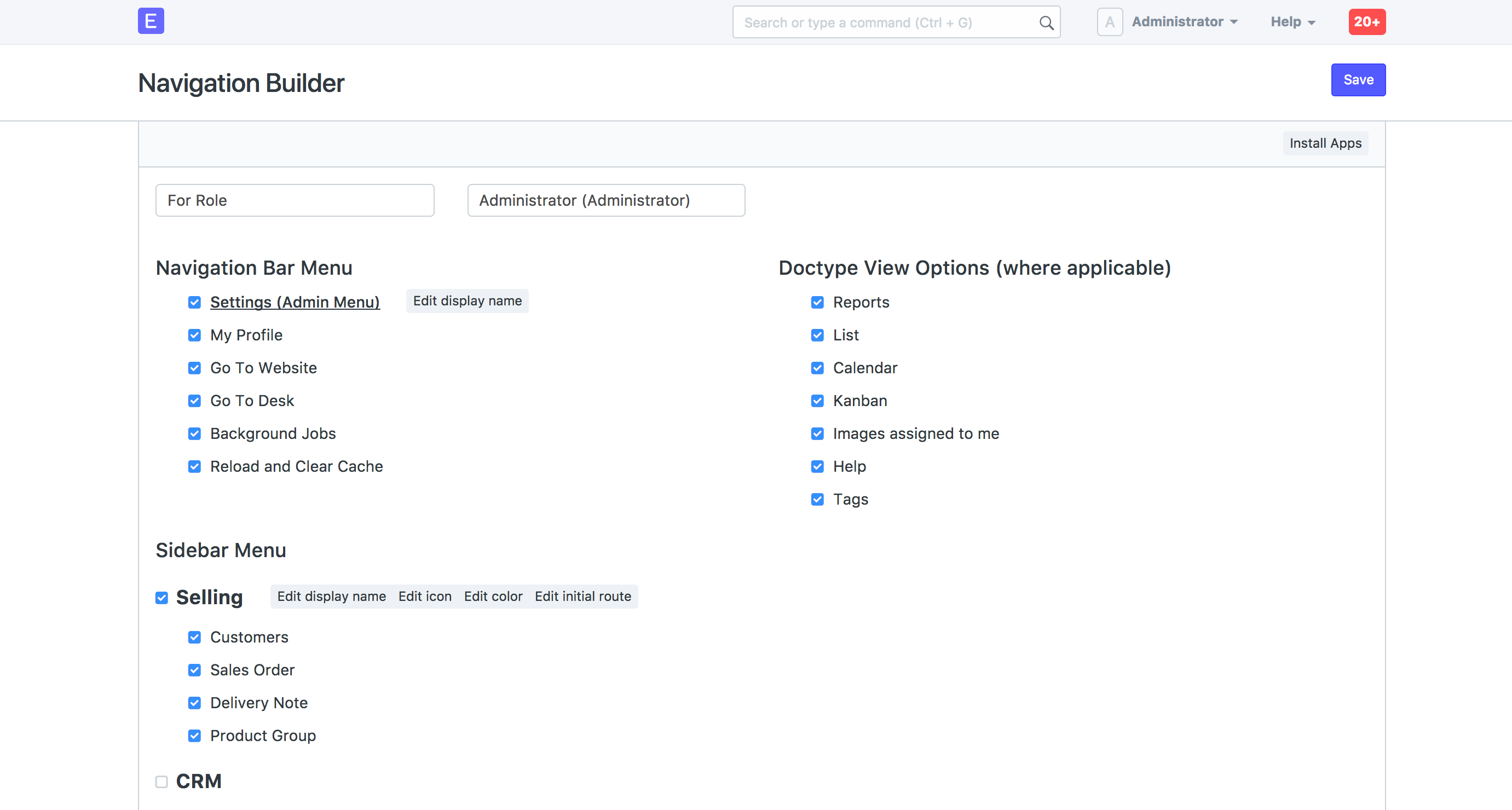
Make menus editable but start with permitted items to user or role
Allow for menu editability to be given to user by admin
I hope to start on this immediately, let me know what you think, I know this will be pretty low level stuff and that’s why I think we need to have it pulled in, but will take some work.
Love it - a much needed change and I think what you have proposed is a fantastic progression in the navigation. Will keep watching this space to see how I can contribute.
I specially Agree with you on containers width. On my MacBook retina ~1/3 of the screen (left and right sides) are empty non utilized spaces, and even the waste is bigger on my desktop big screen.
To all the devs who know frappe backwards and forwards, is that an easy ask? If we rearrange that many files is it an easy switch between the two?
I’ve been looking at how the modules config files are setup and it seems easy to rearrange but not sure about how to flip back and forth. If anyone had a clear path on how they would go about it, speak up and we can get started if the option is critical to most.
I agree with folks that say there should be a toggle between this and the tradittional desktop. More importantly, I’d like to know what would be the default view for users when they login? There are a couple of threads on the forum where UI issues were discussed and the idea of having some sort of widgetized landing page with configurable dashboards seems to be fairly popular
With Navigation Icons being moved to the sidebar in this new design, I would think it should be a good opportunity to look into the issue of having configurable dashboards/widgets on the landing page (Desk)
Even if this achievable easily at the beginning, it will become a nightmare for developers to maintain consistency and updates for the two different UI. Also the platform will start having identity crisis with different interfaces lol.
So the right way of doing interface revamp is to slowly introduce changes between updates so the end use get familiar and not get shocked, and the end result is the users transition to new UI without much complaints.
I am working on this too. I’ll finish it up and share. For the first pass, see the menu builder. The module icon has the option to set the path for initial path for selecting a module and I will add a default module choice for the site home page but want to add dashboard builder that can be used for these and som defaults.
Not sure I follow. You mean the traditional modules view? My goal is that that is reorganized into a admin settings set of items and normal app use for everyday records is part of the new organization. This makes both things far less huge. Now that admin settings and setup (traditional modules view) is accessible if you have privledges in the top user nav dropdown in your user name. So for admins it’s even easier to access.
Also if you are an admin, and you are using the settings view from the top, and say the menu selection is developer/doctypes and you edit one and then accesss it from the sidebar to test and then go back to the doctype menu. The paths are still set since they are different menus now and they will default to were you last were thanks to how they are appended and hidden as you go through the system. A huge benefit and mentally satisfying to be able to build and then use. One from the top menu and one from the side. Separating these roles will help the developer see through the eyes of the user they are trying to serve well.